Worked cross collaboratively with designers and engineers on edtech platform for nonprofit organization
The Literacy Project is a nonprofit teaching at-risk second graders to read. By digitizing their paper-based scorecards, we streamlined data tracking and reporting, saving months of manual work and enabling faster insights.
After stakeholder interviews, our team defined key user needs and designed intuitive digital scorecard flows that mirrored their existing processes while enhancing efficiency. We prioritized simplicity and clarity to ensure an easy transition from paper to digital for all users.
UX/UI Product Designer
October 2021 - June 2022 (9 months)
6 Designers and 17 Developers
Digitize the workflow
Replace manual, paper-based scorecards with a digital system to streamline data entry, storage, and reporting.
Improve efficiency and accuracy
Reduce the time and errors associated with processing over 1,500 scorecards annually, enabling faster access to student performance data.
Enhance usability for staff
Design an intuitive platform that aligns with existing workflows, making it easy for administrators and master teachers to adopt without extensive training.
User flows
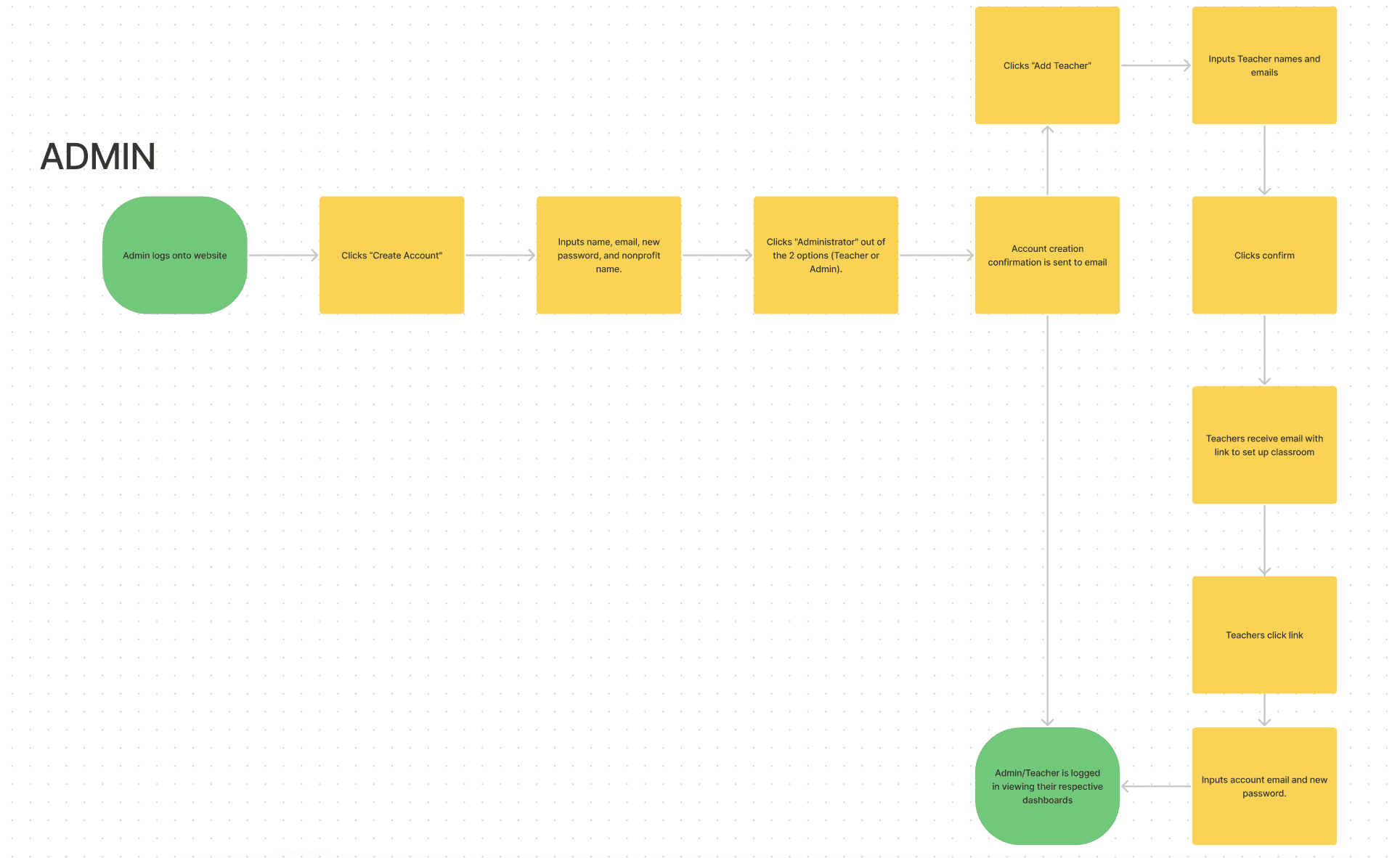
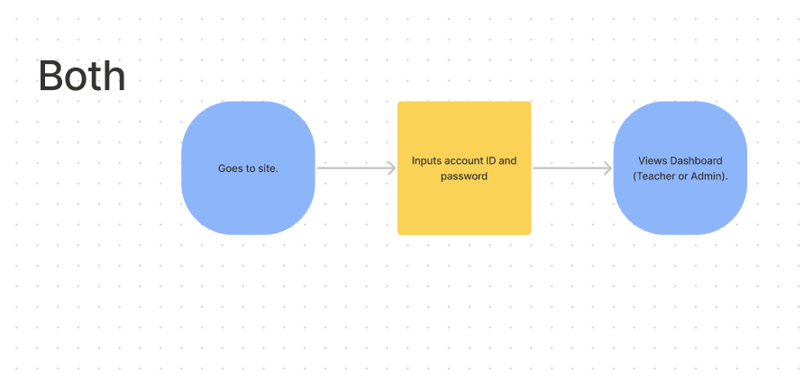
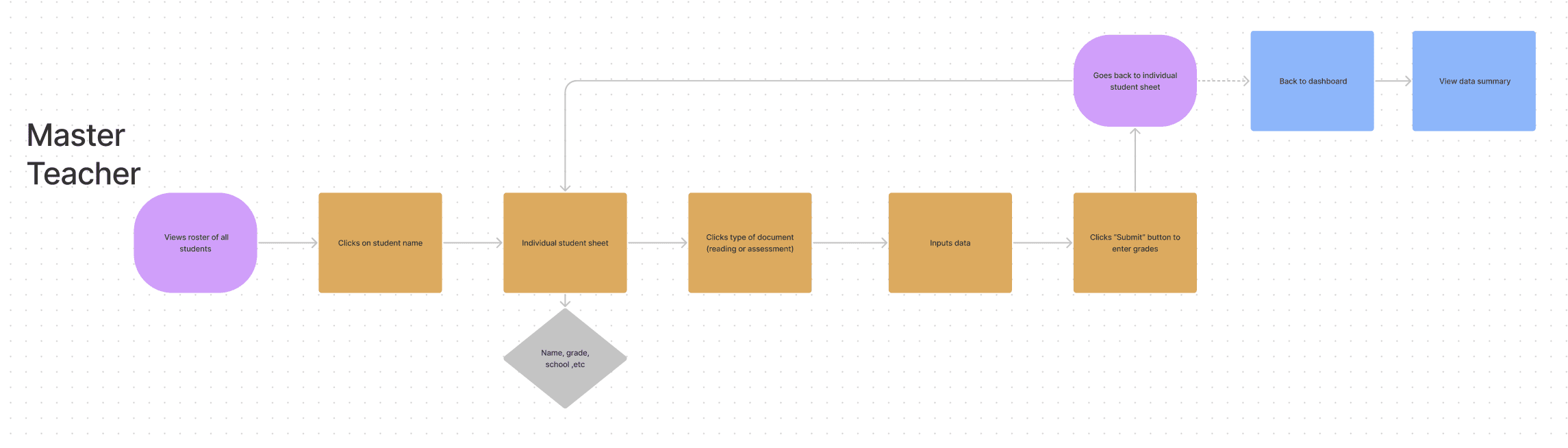
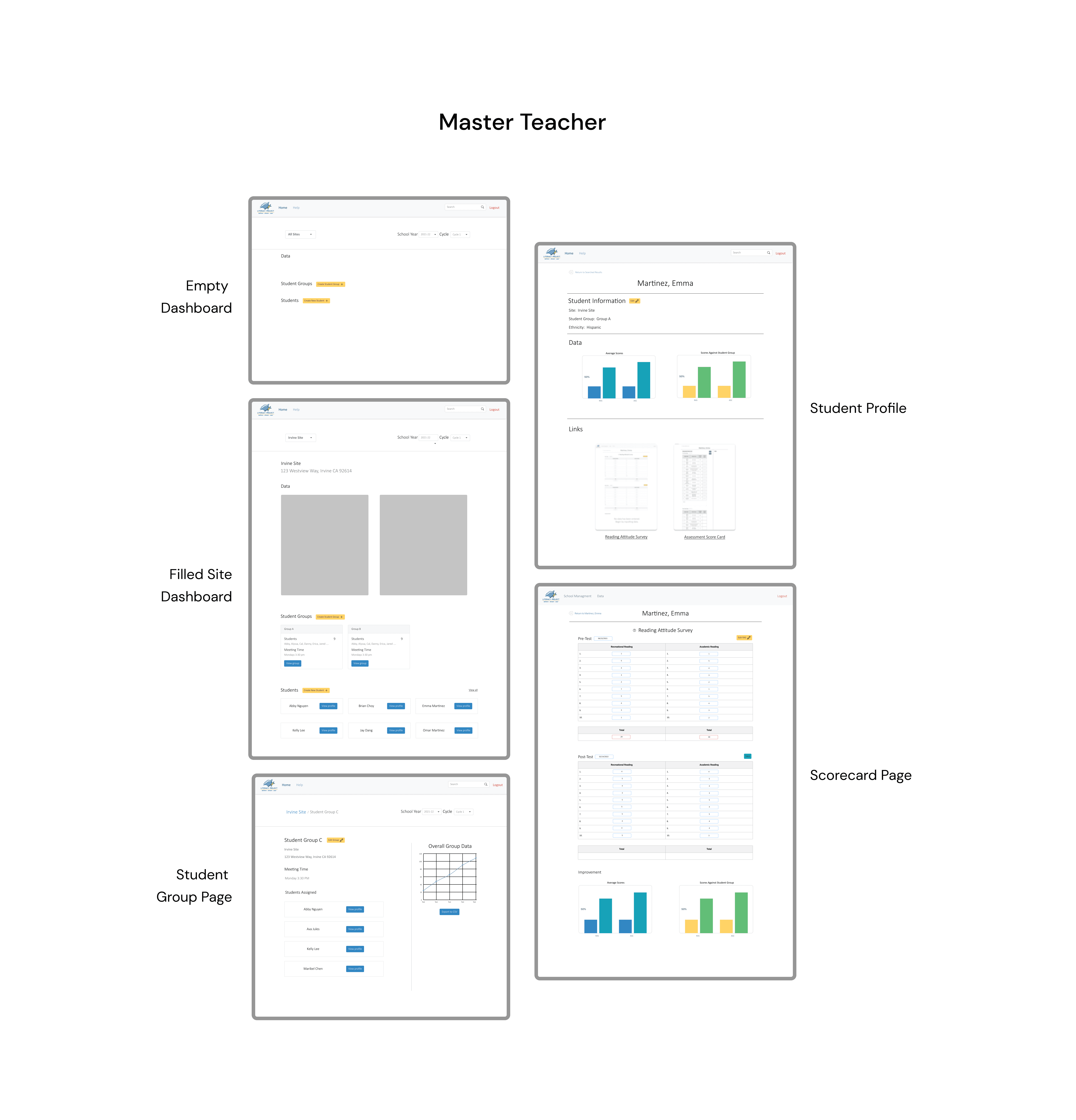
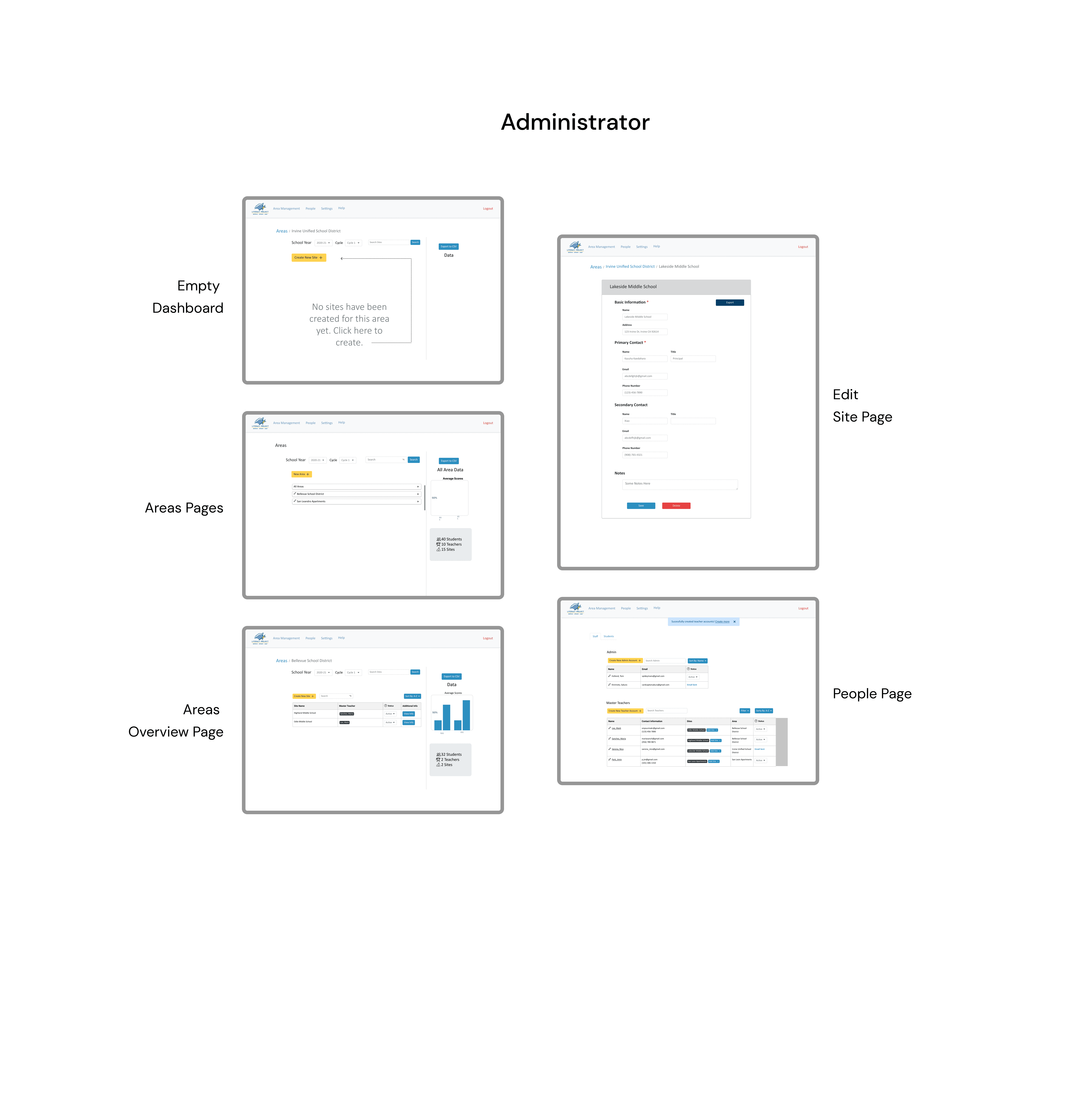
When we received the project requirements, we learned that the platform would serve two primary user types: administrators and master teachers. Administrators manage sites and invite master teachers to their assigned locations, while master teachers create student profiles, organize groups, and complete scorecards.
To capture these distinct workflows, we designed three user flows—one for administrators, one for master teachers, and one shared between both roles. I collaborated with a fellow designer via Zoom and FigJam to map these flows and ensure a clear, efficient experience for each user type.
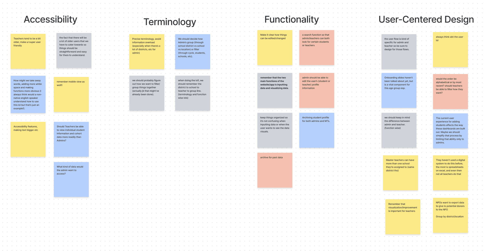
Personas & affinity mapping
After conducting initial research, we moved into an affinity mapping session to organize our insights. As a team, we spent about 15 minutes brainstorming ideas for the platform’s design. Once we grouped similar notes, four key themes emerged: accessibility, terminology, functionality, and user-centered design.
During this collaborative exercise, we uncovered several questions about how the platform should function. The open brainstorming process encouraged us to think beyond the given requirements and explore new opportunities to enhance the user experience.
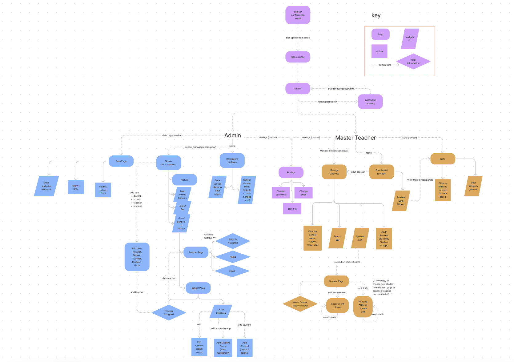
Information architecture
We then collaborated to develop the information architecture, helping us organize and visualize the structure of our platform. This process made it easier to understand what pages were needed and how information should flow for each user type. Administrators (shown in blue) and Master Teachers (shown in mustard orange) had distinct responsibilities, which we outlined within the architecture.
While the diagram looked complex, it provided valuable clarity—giving us a solid foundation for understanding page relationships, user actions, and overall platform functionality.
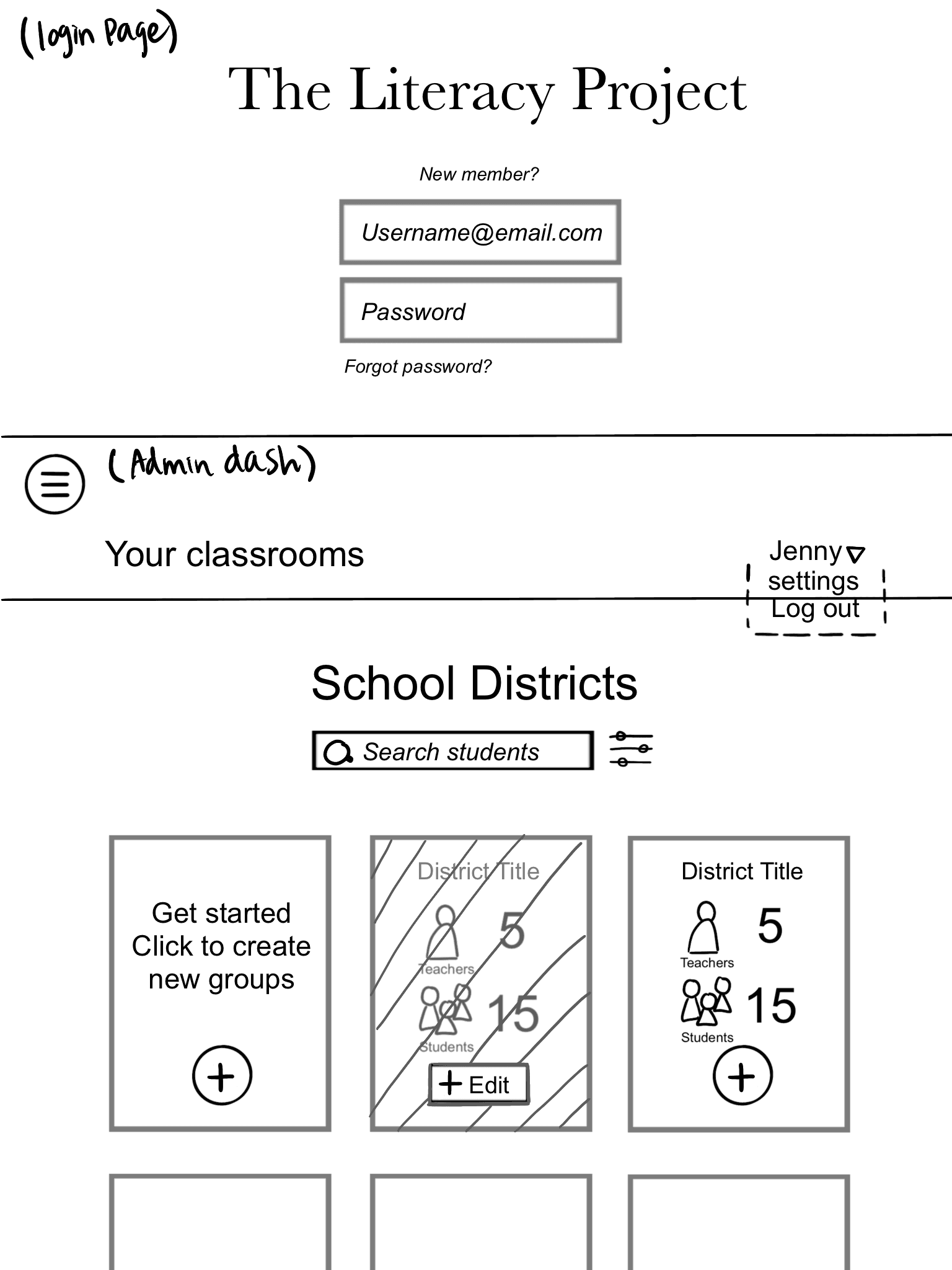
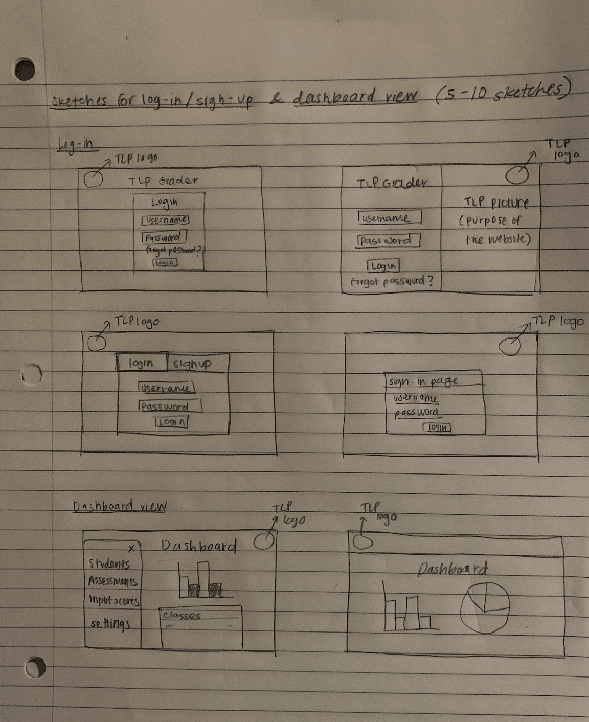
Sketches
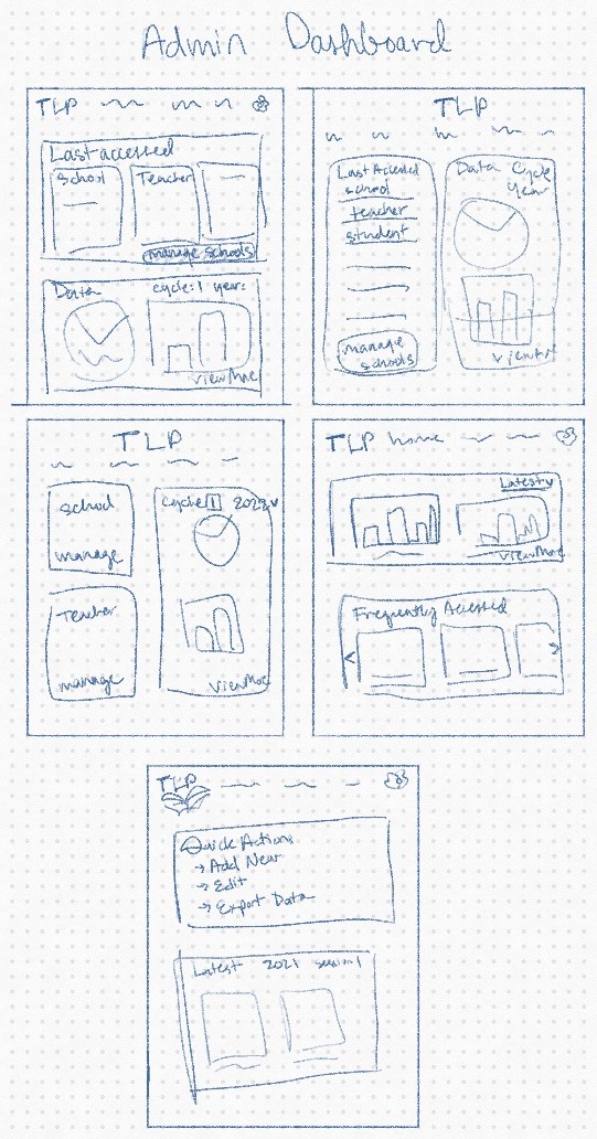
Mid-fidelity wireframes
After we worked on the sketches, we moved on to the mid-fidelity wireframes. We discussed the findings from the sketches and made the necessary changes based on the research we had already conducted.
Because we had two user bases to cover, our design team split up into two groups: Master Teacher and Admin.
User testing insights
Our team conducted usability testing with five participants: two Administrators, two Master Teachers, and one college student. Although we initially planned to include three Master Teachers, a last-minute change gave us the opportunity to gather an outsider’s perspective as well.
We developed a testing script with realistic scenarios reflecting typical platform tasks. Using a Zoom screenshare, we observed participants’ interactions and identified pain points within the designs. To evaluate usability, we also performed A/B testing on two versions of the Master Teacher Dashboard, allowing us to determine which layout was more functional and intuitive for users.
Back button
"I struggled with the breadcrumb back button. It was confusing and I wasn’t used to that type of back button." (53Y, F)
Score inputs
"The scorecard buttons were hard to find and that’s why I had difficulty with inputting the scores. I wish it was visually more fun." (34Y, F)
Customized notes
"Include a notes section in the area pages. We want to be able to have the option to make comments if we need to." (56Y, F)
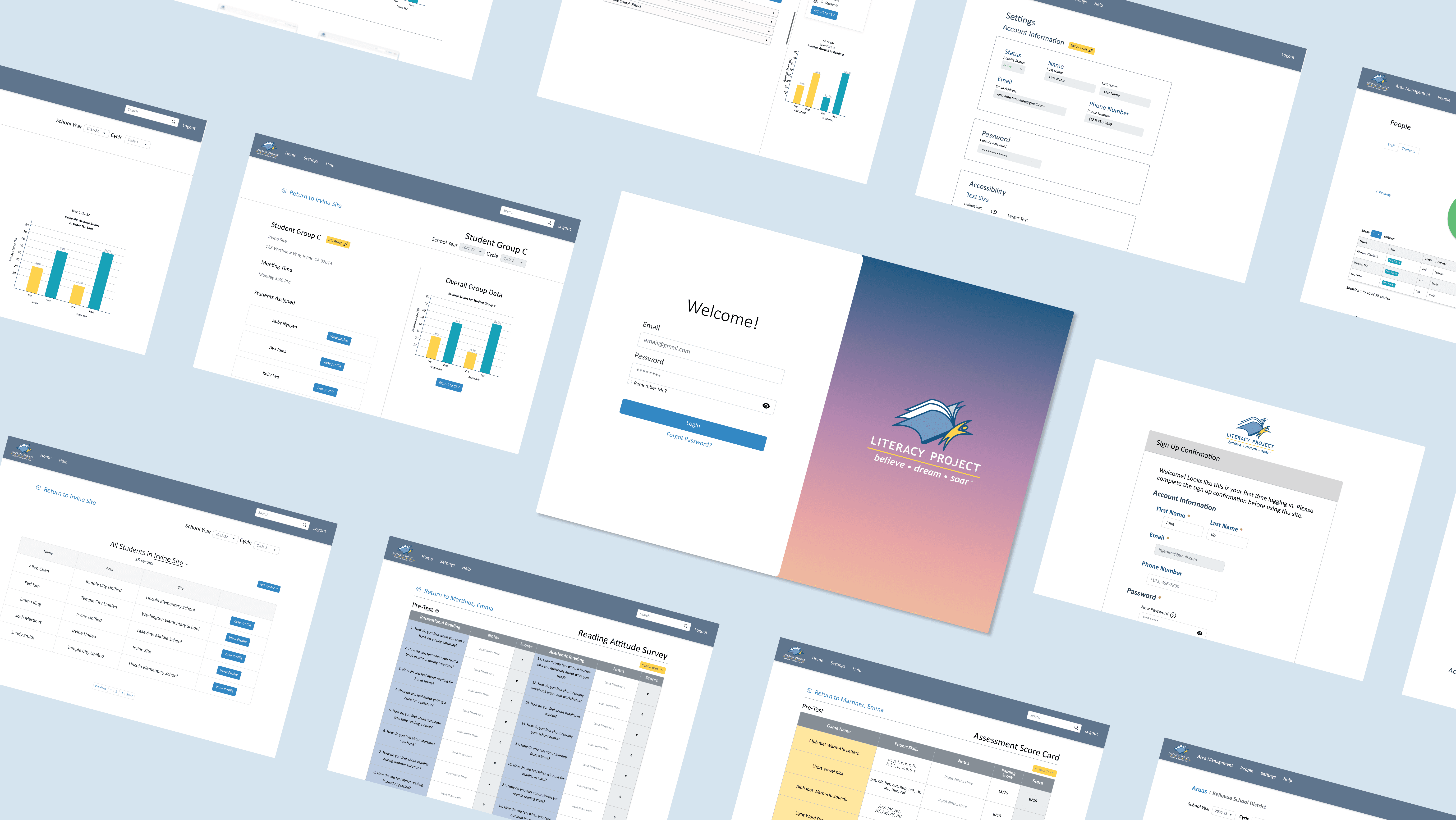
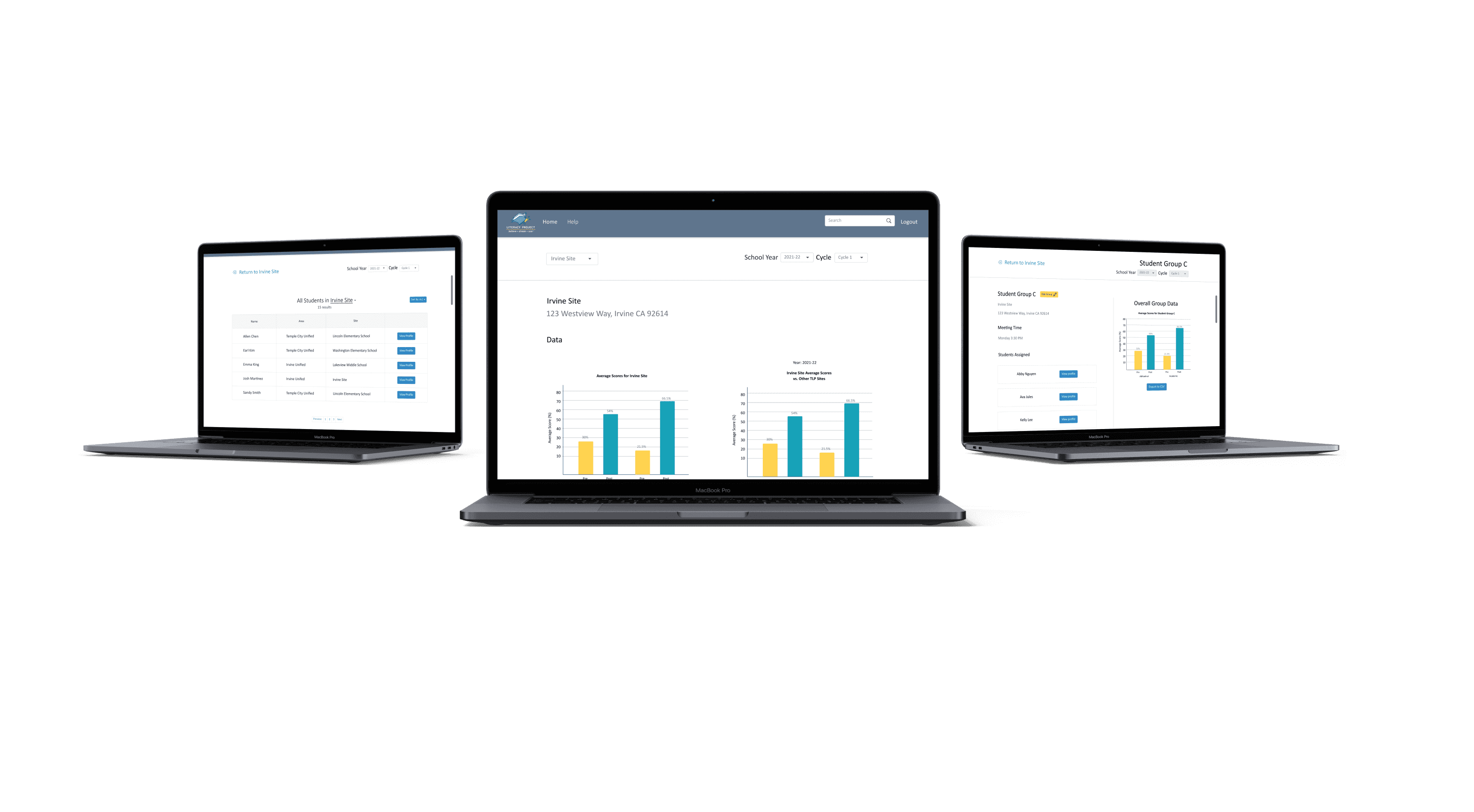
Final screens


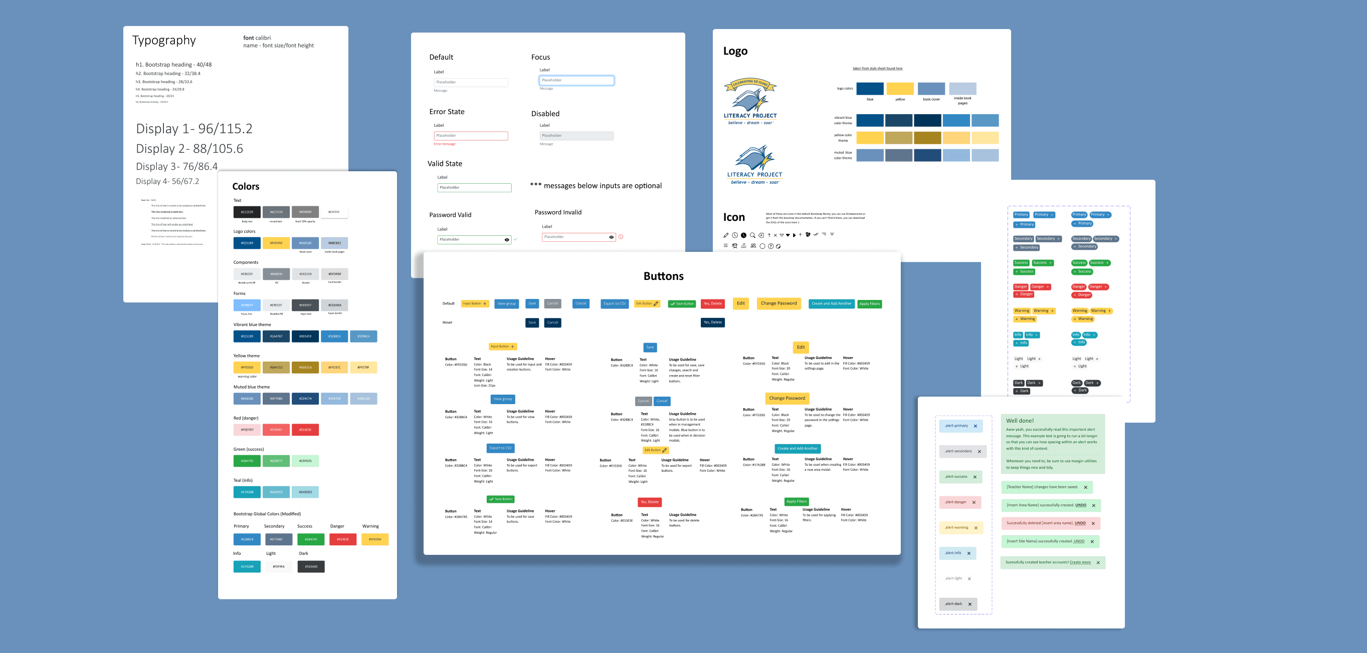
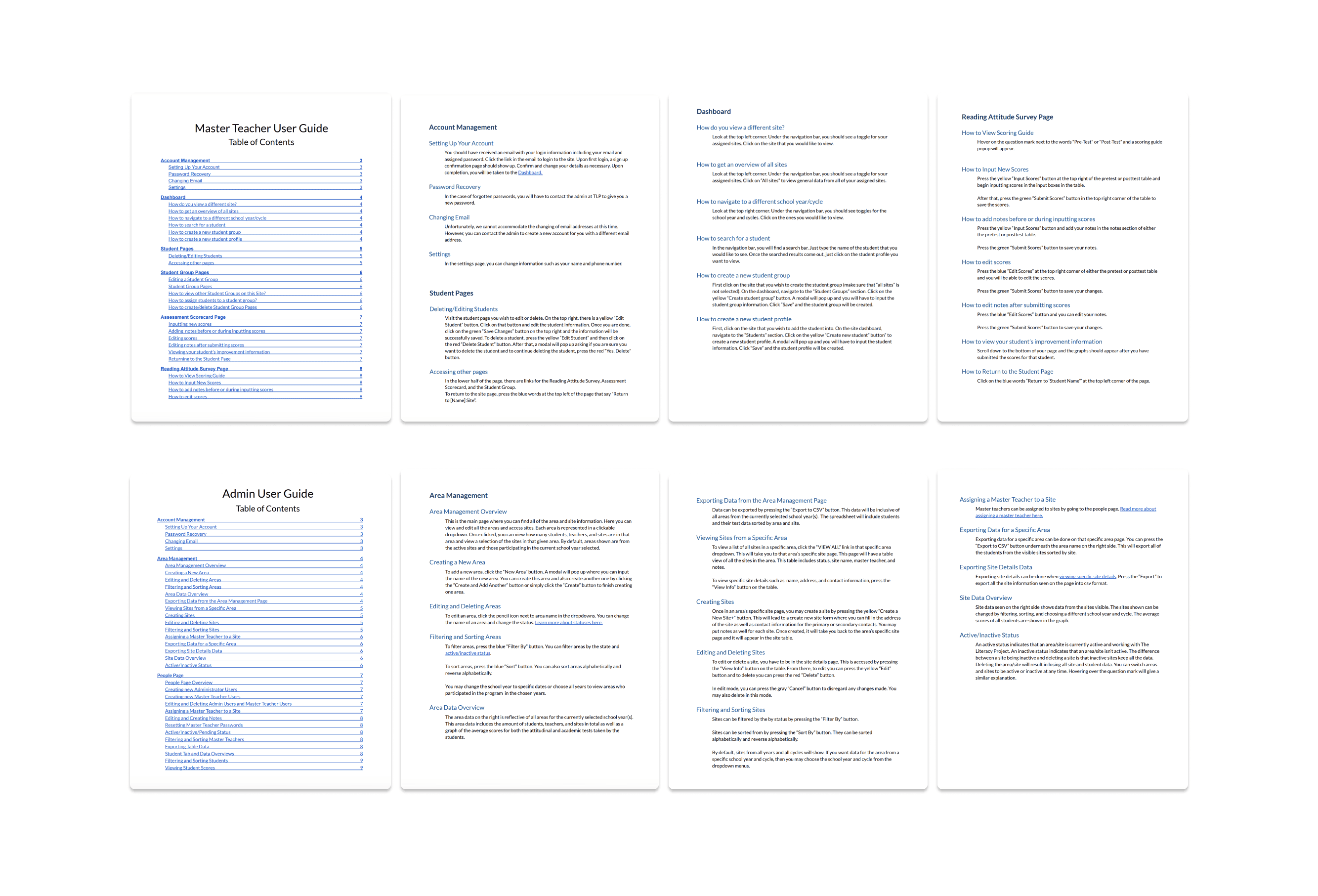
Style guide and user guides
Takeaways
Improving cross-team collaboration
Working with developers for the first time was a major learning experience. To streamline communication between design and engineering, we introduced a change log, a shared document tracking all design updates by page. This system kept everyone aligned despite parallel workstreams and significantly improved collaboration throughout the project.
Balancing functionality and aesthetics
Functionality was the top priority for this project. I faced the challenge of creating visually appealing designs while incorporating all the necessary information, and often had to adjust my design choices to ensure usability. While the designs were not always the cleanest, they were more functional and met the needs of our stakeholders. This experience reinforced the importance of finding a balance that addresses both user and business requirements.