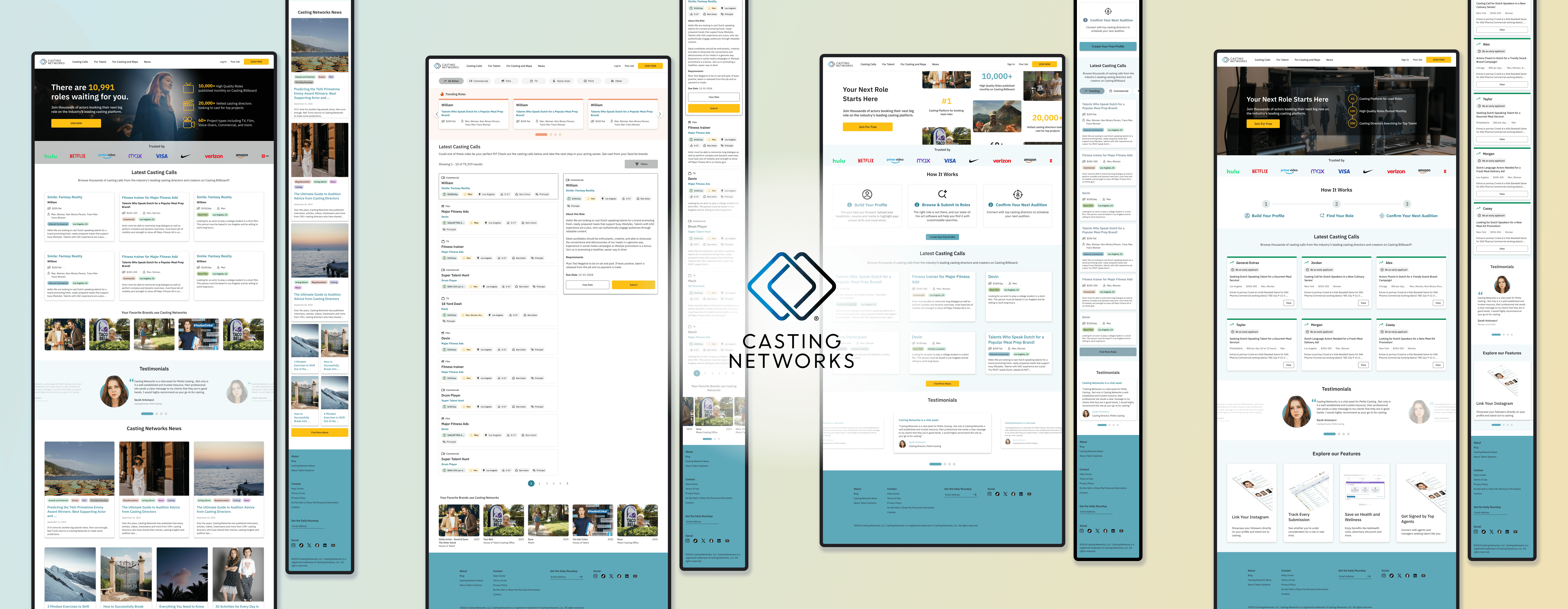
Redesigned marketing site with a product-first approach to increase top-of-funnel conversions.
What began as a concept quickly evolved into a collaborative effort with the product, marketing, and executive teams. The initiative originally started as a side project to introduce customer-focused branding, and after pitching it to our CPO, we worked closely with multiple teams to determine the most effective approach.
Following months of research with internal stakeholders, we developed user-facing MVP designs aimed at maximizing sign-ups. After launch, we established a dedicated marketing site team that integrated product and marketing efforts to continuously A/B test and optimize the site.
Role
Sole UX/UI Product Designer
Timeline
October 2024 - Current
Tools
Figma, WordPress, HotJar, VWO, Google Analytics
The problem
Unclear value props
Visitors may not immediately understand what Casting Networks offers or how it benefits them. It was unclear who our audience was.
Inconsistent branding
The marketing site and app previously had inconsistent branding. This redesign aims to unify the experience, creating a seamless and cohesive journey across both platforms.
Poor conversion flows
Calls-to-action (CTAs) were scattered, unclear, and not compelling, reducing sign-ups or trial conversions.
Discovery and research
Competitive analysis
During the research phase, I conducted a competitive analysis to understand how other casting and talent platforms structure their experiences, from landing pages to value propositions. This helped identify industry standards, usability gaps, and opportunities for Casting Networks to stand out. The insights guided design decisions to create a more intuitive, modern, and differentiated experience that better aligned with user expectations.
SWOT analysis
The analysis provided a clear framework for assessing the marketing site’s current performance and market position. It helped identify strengths to leverage, weaknesses limiting engagement, and opportunities to differentiate the brand. These insights informed the redesign strategy, ensuring every design decision supported stronger storytelling and business growth.
Site mapping
The site map defined the structure of the new Casting Networks marketing site, organizing content to create a clearer and more intuitive user journey. It helped identify redundant pages, streamline navigation, and reduce unnecessary content by consolidating and removing excess pages. This cleanup resulted in a more focused, easier-to-navigate experience that ensured key information such as platform features and membership options was easy to access.


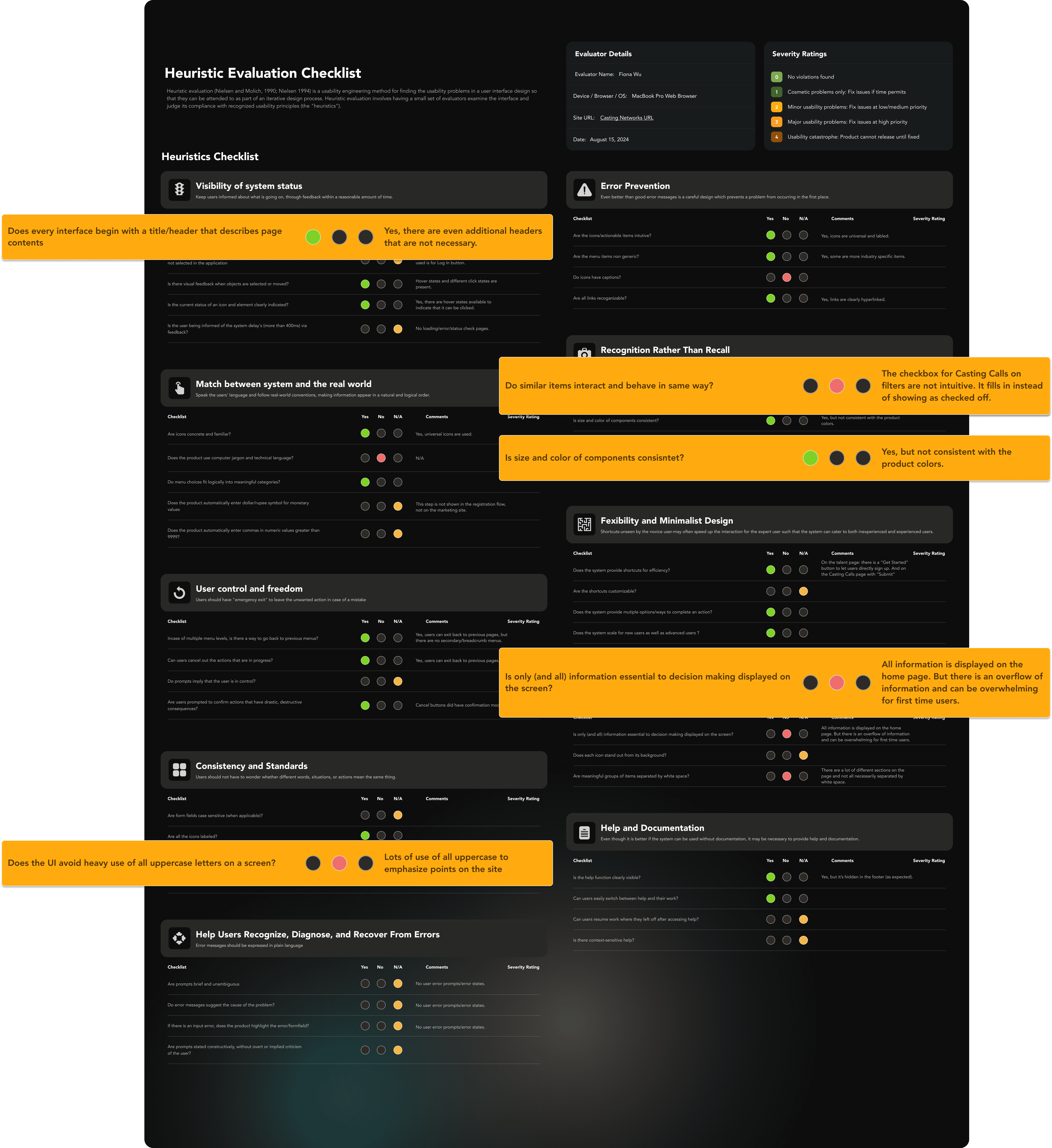
Conducting a heuristic evaluation early in the research phase helped establish a clear baseline for usability and experience quality across the site. By evaluating the site against proven usability principles, I was able to quickly identify friction points, inconsistencies, and missed opportunities that were impacting clarity and conversion. This approach was especially valuable for a marketing site redesign because it surfaced issues without requiring extensive user research, allowing us to make informed, experience-driven decisions within tight timelines. The findings directly informed navigation, content hierarchy, and interaction patterns, ensuring the redesign addressed both surface-level polish and foundational usability improvements.
Conceptualization
I began the conceptualization phase by creating low fidelity frames to map out the overall structure of each page and establish a clear content hierarchy. This helped define general layout guidelines and ensured key elements were placed intentionally before exploring visual direction. From there, I used the Crazy 8’s method to rapidly iterate on multiple design concepts, pushing beyond initial ideas and testing different layouts and messaging approaches. Sharing these early concepts with internal stakeholders allowed me to gather quick feedback, align on a direction, and move forward with confidence before investing in higher fidelity designs.
After sharing the initial designs with internal stakeholders, I gathered clear and actionable feedback that helped solidify the design principles and direction moving forward. I then partnered closely with product and marketing to refine the experience and deliver final Figma screens for engineering. We intentionally moved quickly to launch an MVP, knowing the site would continue to evolve through ongoing A/B testing and optimization post launch. This process reinforced the idea that while user testing during design is valuable, many assumptions still remain until real users interact with a live product. By testing the actual experience in production, we were able to validate decisions, learn faster, and continuously improve the site beyond the initial delivery.
A/B tests and optimizations
Overview
After the MVP launch, we formed an experimentation pod focused on continuously testing and optimizing the new marketing site. Working from a shared product and marketing roadmap, we ran rapid experiments on elements like CTA copy, imagery, layouts, trust signals, value propositions, and color usage to understand what resonated most with users. The fast pace of iteration required close collaboration and frequent design QA on my end to ensure all changes maintained a high bar for quality, consistency, and brand integrity.
Registration CTA copy
To increase top of funnel conversions, we tested different registration CTA language. Version A, “Join Now,” performed 8% better than Version B, “Trial for Free Today,” indicating stronger user alignment with simpler, action oriented messaging.
Homepage hero copy
An A/B test on homepage hero copy showed that Version B increased conversions by 6%. Its concise, direct messaging proved more effective at quickly communicating value to users.
Talent landing page hero
We A/B tested two design variations for the talent landing page, each featuring the same statistics but different visual treatments. Version A included a moving carousel of real commercials cast through our platform, while Version B used a still stock image. Despite being less flashy, Version B performed 7% better, suggesting users responded more positively to a simpler, more focused visual approach.
Takeaways
Launch, test, learn
One of the biggest lessons from the marketing site redesign was that you don’t need to ship the most polished or flashy product to learn. Launching an MVP and running A/B tests on real designs allowed us to gather fast, actionable insights from diverse user behavior. We were surprised by how often simple, clean designs outperformed more elaborate ones, reinforcing that assumptions about users can often be wrong and real testing is the fastest path to understanding what actually works.
Collaboration drives clarity
This project reinforced how valuable close collaboration with product and marketing is when redesigning a site. Iterating quickly with stakeholder feedback allowed us to align on priorities, clarify goals, and make faster decisions without overcomplicating the process. It reminded me that strong cross-functional communication can be just as impactful as the designs themselves, especially when working toward a fast-moving MVP.


