
The Literacy Project
Edtech Platform for Nonprofit Organization
Role UI/UX Designer
Team 6 Designers and 17 Developers (Software Engineers)
Timeline October 2021 - June 2022 (9 months)
Online Tools Figma, FigJam, Miro, Zoom, Notion
Overview
I worked with UC Irvine's organization, Commit the Change (CTC). Our organization's mission is to: develop high quality software for non-profit organizations while giving students at UC Irvine opportunities to develop tech, with purpose. I was paired to the The Literacy Project (TLP) non-profit organization. TLP addresses illiteracy at its earliest stage by teaching at-risk second-graders how to read.
TLP needs to track the performance of each student before and after they go through the program. Currently, this is done with physical scorecards, which are tabulated to create reports to send to schools and other parties interested in the outcomes of the program. Last year, TLP processed over 1500 cards, which took them multiple months.
I worked with designers and developers to create a platform to manage literacy scorecards for children enrolled in their reading programs. Digitizing these scorecards will allow for a more efficient workflow, saving the NPO countless hours of work. Digitization will also make scorecard information available sooner and open the door for more advanced analysis of the collected information.
Competitive Analysis
We created a competitive analysis on other edtech platforms. We did research on MyLab, Google Classroom, and Seesaw. We looked into the goals, methodology, top opportunity areas, and recommendations of each platform. While we drew a lot of inspiration from this round of research, it also expanded our knowledge onto the features and functionality of each of these platforms. This helped us to further our research for how our platform could perform even better than the existing edtech platforms.
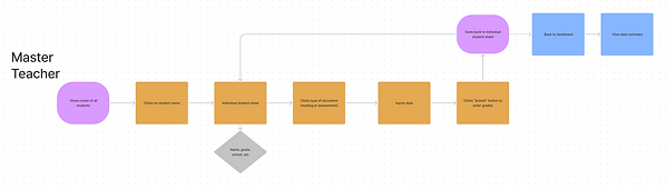
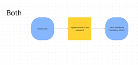
User Flows
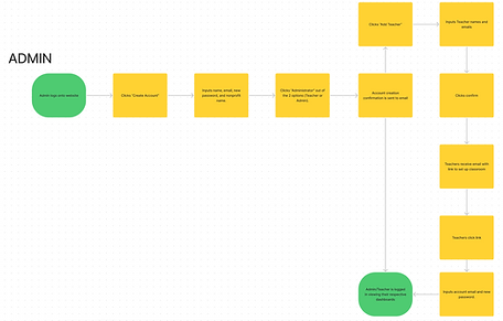
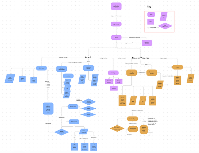
When given the requirements of our project, we were told that there are only two types of users that will use our platform–administrators and master teachers. Administrators are responsible for keeping track of sites and inviting master teachers to their assigned sites. Master teachers are responsible for creating students and student groups. They will also need to complete the scorecards.
We created three user flows–one for administrators, one for master teachers, and one for both sets of users. I collaborated with one of my fellow designers through Zoom and FigJam to create the flows.
Personas


Affinity Map
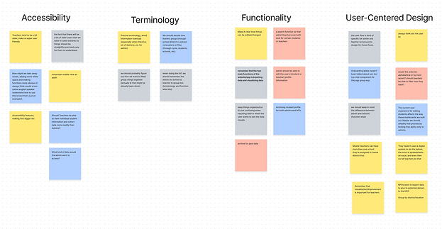
After some research, we moved onto affinity mapping. Collectively, we spent 15 minutes to brainstorm any thoughts and ideas that we had for the designs. After discussing the similarities within our note cards, we created 4 categories to break down our ideas into. We found that accessibility, terminology, functionality, and user-centered design were the themes that we all focused on.
While participating in this brain dump, we realized that we had many questions about how the platform would function. Creative collaboration gave us the chance us to think outside from the requirements that we had and extend our design thinking.
Information Architecture
We then collaborated to create the information architecture. This would make it easier for us to digest the pages and showcase the information we would need to include on our platform. We had to cover the bases of our two user groups and their different functions. Administrators (in the blue color) and Master Teachers (in the mustard orange color) have different action tasks that they need to complete and are outlined here in this information architecture.
This gave us a better understanding of the pages we needed, as well as the functions of each of those pages. While information architectures can appear to be messy and chaotic, it was very helpful in giving us designers a good breakdown of our platform.
Sketches


Low Fidelity Wireframes
After we worked on the sketches, we moved on to the lo-fi wireframes. We discussed the findings that we found from the sketches and made needed changes to what we saw fit based on the research we had already conducted.
Because we had two user bases to cover, our design team split up into two groups: Master Teacher and Admin.

Mid-Fidelity Wireframes
User Testing and Iterations
Designers then tested our product to 5 future users: 2 Administrators, 2 Master Teachers, and 1 college student. Our original plan was to test with 3 Master Teachers, but due to a medical emergency, we were only able to test with 2. While this was a minor hiccup in our plan, it actually gave us a chance to get an outsider perspective as well.
We created a prototype script with different scenarios of the tasks that they would normally do on the platform. Through screenshare on Zoom, we were able to gain a better understanding into their pain points with the designs. We performed A/B testing and tested out two different versions of the Master Teacher Dashboards. We did this to gain insight into which dashboard would be more functional and user-friendly for the users.
Insights
Master Teachers
Back Button
"I struggled with the breadcrumb back button. It was confusing and I wasn’t used to that type of back button." (53Y, F)
.png)
Score inputs
"The scorecard buttons were hard to find and that’s why I had difficulty with inputting the scores. I wish it was visually more fun." (34Y, F)
Administrator

Customized Notes
"Include a notes section in the area pages. We want to be able to have the option to make comments if we need to." (56Y, F)
"The active status makes more sense to be on the very left right next to the Master Teachers so we can see it right away." (32Y, F)
Active Status
Style Guide and User Guides
.png)
High Fidelity Prototype

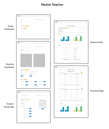
Master Teacher Dashboard
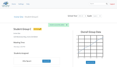
Teachers can create new student groups and students as well as manage the student group pages.
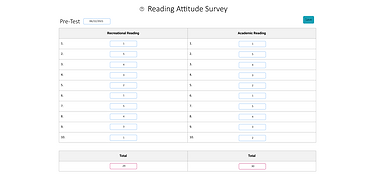
Master Teacher Scorecards
Teachers can input pre and post test scores on student pages. After they input test scores, they will be able to see the data.
%20(1)_gif.gif)
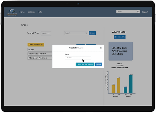
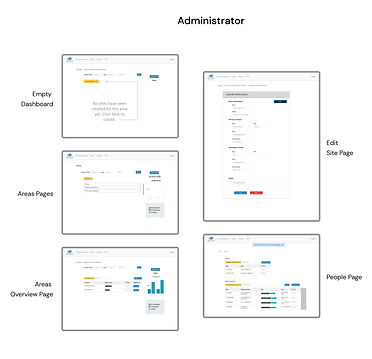
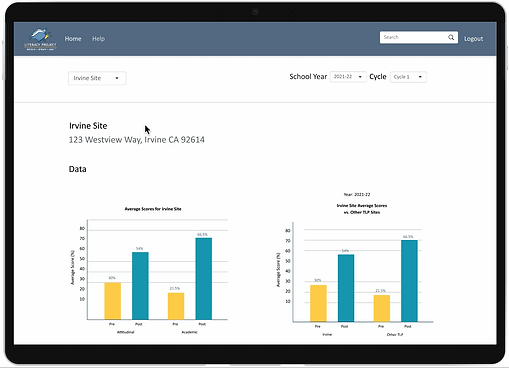
Administrator Dashboard
Admins can create and manage the school sites through the dashboard. They can easily view data of the overall area through the graphs.
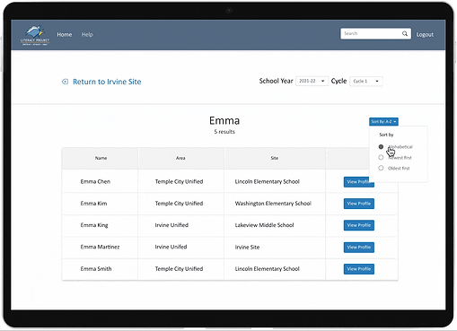
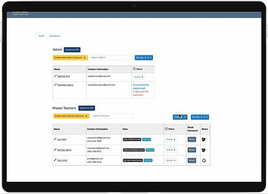
Administrator People Pages
Admin can keep track of the current teachers/staff in their program. Admin is responsible for keeping track of their passwords and account creation. They also have access to view the overall data of their students.
_gif.gif)
Results and Takeaways
-
👩💻👨💻 It was my first time working with developers and it was a huge learning curve for me. To improve cross team collaboration, we implemented change logs to help us coordinate better communication between our design and engineer teams. The change log was an ongoing document where we kept track of all the design changes we made. The engineers were working simultaneously while designers were still working through iterations. Instead of telling the engineers about every small design change, we created a change log and organized it into specific pages. This made it easier for the engineers to stay up to date with the ongoing changes. It would’ve been helpful if we had created this earlier on for smoother integrations, but I’m glad that we were still able to utilize this tool before our project was completed. It allowed for better cross team collaboration.
-
🖇 Functionality is key. It was difficult for me to create aesthetic designs while still incorporating all of the needed information. Instead, I had to compromise on my own design choices for more functional designs. While they were not the cleanest designs, it was much more usable and fulfilled the requirements of our stakeholders. It’s hard to please all parties so you just need to find a healthy balance that addresses everyone’s concerns.
-
🎳 Teamwork is important and you should try to get to know your teammates on a more personal level. Because we were remote for the whole year, we weren’t able to get that in person experience. Through our team bonding exercises, we were able to strengthen our relationships with one another and improve our overall productivity. We would host socials to build friendships outside of work. This helped me gain a better understanding of my team and how they work and talk as people. It felt much more rewarding knowing that I completed and end to end project with some of my friends and not strangers.