GroceryPS
Grocery shopping GPS application that shows exact aisle and shelf of needed items
Course Project in Human Computer Interaction Requirements and Evaluation
Role Lead Designer
Team Jose Mahcillas, Mohammed Shielleh
Timeline January - March 2021 (10 weeks)
Online Tools Canva, Miro, Figma, Zoom
Overview
With COVID-19 affecting millions across the globe, many people want to cut down on their time in public spaces as much as possible. This has also changed many people's attitudes about how we can simplify the world and make everything much more accessible. Grocery shoppers are frustrated when they spend too much time in the grocery stores because they often have to search through every aisle for items. This takes valuable time away from their other responsibilities.
With this, my group has decided to design an application to help people decrease their time in a physical grocery store while also enhancing their shopping experience. Specifically, we hope to design a tool that will provide people with the exact aisle number and shelf for their desired item. This will help them navigate through the store easily without needing to ask workers for item locations.
Problem Statement
GroceryPS was designed to help users be more effective in the grocery store by reducing the amount of time wasted finding specific items in the never ending aisles of products. We observed that other related apps on the market only focus on certain franchises and sometimes fail to show the user the where the product is placed within their store. We combined the inventory and locations of a multitude of franchises, so that our app is able to help the user locate their product in any grocery store by giving them the exact aisle and shelf information along with many other features that help users be safer and more efficient in these public spaces while also reducing the need to download individual apps for each store.
Competitive Analysis
We performed a competitive analysis on BestBuy, Ikea, Instacart, Walmart, and Target. We found data from both direct and indirect competitors to get a more widespread idea. We conducted research into each brand’s target audience, number of physical stores, items available, preciseness of item (on the application), extra features, and user experience. Through this competitive analysis, we were able to hone in on our specific target market and used these insights to cater our own application features to have a more competitive advantage. By focusing on these categories, we were able to see what features were successful and which were not and get a better understanding of the marketplace for our product.
All of us did research on our competitors. To make the research more visibly comprehensible, I turned them into infographics. I created one infographic for the information and another infographic for the analysis of each of their interfaces.


Affinity Diagram
Following the information gathered from our survey and interviews, I suggested that we create an online affinity diagram to make sense of all our data. We all worked on a Miro board where we each spent a few minutes jotting down our key ideas on our own post it note color. After analyzing our data, we synthesized our findings. We then took turns to discuss each of our post notes. From there, we started bundling similar ideas to find “groupings” that would help us connect our ideas. This allowed the team to share and communicate ideas to get a larger scope of the problems that we will need to address in our prototype. This helped us organize our thoughts and put it into practice. The key lessons I learned from our competitive analysis are:
-
From our competitive analysis, we learned how our competitors' applications are not very personalized. This is why we concluded that our prototype should have a "Hello Name" personalized message at the home page. This will give our application an edge with a much more inviting and friendly interface. We catered the applications to have the users in mind at every step of the online grocery process.
-
To help our customers save more time, we included whether or not the search item was in stock. For example, we meant that when you search, "Fruits and Vegetables," you will see whether or not the listed items are available at your chosen store. From the Target app, we noticed that users have to click on the actual item before seeing the availability. Instead of making users jump from page to page, we included availability for better convenience and clarity.
-
From our anonymous surveys, some of our participants shared the difficulties they encountered when using online grocery apps. Some applications failed to show "related items" so we made sure to include it in our application.
Personas
Using data from our surveys and interviews, we created two personas–one college female and one middle aged male–to better understand the focus of our application. The key takeaways from our personas are:
-
Being more efficient with time
-
Finding the best deals without spending too much time in stores
-
Reduce time spent in crowded areas due to ongoing pandemic
Jose worked on these personas utilizing the data gathered from each of our interviews and surveys.


Low Fidelity Wireframes
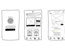
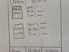
Before creating a high fidelity prototype, we each created low and mid fidelity wireframes. In these sketches, we mapped out the key features to highlight and focus on. Because we limited each sketch to a few minutes, it focused us into only drawing out the most important components of the application that we would prototype. Key takeaways from these sketches:
-
Search bar to find an item
-
Exact store location
-
Price of the item
-
Search history (favorite items) for easy reference
-
Availability of item
All of our sketches were created before we finalized our product name. This is why many of my sketches include our group name (HCI Anteaters) and different logos. Even though my mid fidelity sketches did not have to so detailed, I think it visually helped me a lot when creating the final prototype. It gave me a better understanding of which elements we wanted to include.

High Fidelity Prototype

👋Click here for our Interactive Prototype!👋
Results and Takeaways
In my first ever case study, I worked to ideate, create, interview, and prototype all on my own. What I didn’t realize was how important collaboration and teamwork are when designing applications for real users. This was my first group case study and my amazing team was able to collaboratively work together remotely through open and honest communication. From our diverse cultural and educational backgrounds, we were able to bring lots of different perspectives into the project. Throughout every step of the design process, we gave constructive feedback and every little comment was extremely beneficial to the creation of our product.
There is no such thing as too much research. Throughout the duration of the 10 weeks, I learned just how important user research is, and that it should not be rushed. In the past, I was focused more on the design work than on the research. I have now learned just how prior research is essential and crucial to understanding each and every single potential user. After surveying and interviewing participants from a wide range of ages, I was able to get a better understanding of their needs and pain points. I know that a universal design is very hard to achieve, but a design catered for our target audiences is the next best thing. If given more time, we would’ve conducted user testing and refined our designs even further! In fact, my team and I were talking about how great it would be if we could turn it into a real business, so maybe we will return to this in the future! 💬
-
💡Knowledge is key. Never underestimate the power of research! Fully understanding your target audience and your users (as well as potential future users) is extremely important.
-
🗒Miro boards are amazing for collaborative work! It was my first time utilizing the application and it was a great way to productively gather all our data and ideas.
.png)


