
Gem Mart
The central hub for small businesses
Competition UCI Design Project Teams 🏆 1st place winners
Role Project Leader, UX Designer
Team Jacqueline Le, Sabrina Nguyen-Hoang, Maria Taipe
Timeline April - May 2021 (8 weeks)
Online Tools Figma, Miro, Zoom
Overview
Small businesses don’t have the funds for large marketing campaigns, which limits their growth and customer acquisition. Many small businesses have found some success through word-of-mouth or social media, but this growth is still limited. Especially so during COVID-19, small businesses have been struggling to stay in business while large corporations are continuing to grow and expand.
So how might we create a space for customers to shop intentionally while helping small businesses gain exposure?
Competitive Analysis
We created a competitive analysis on some of the leading small businesses/second hand companies. We narrowed our search on some of the leading brands including: Depop, Etsy, Instagram, Miiriya, Shopify, and Yelp. We wanted to see how these companies held up in regards to ethics and sustainability. Our mobile application was focused on helping customers shop intentionally so we conducted thorough research on this area and how we might stand out in comparison to our competition.
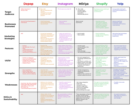
Etsy, a very popular website for hosting small businesses, invests in sustainability projects. There was not too much on how they incorporated sustainability into their interface, aside from their articles. We used this idea to incorporate helpful articles on sustainability in the settings tab. We also wanted to make sure that our application would have ethical certifications to help customers narrow their search.
User Interview and Survey Findings
-
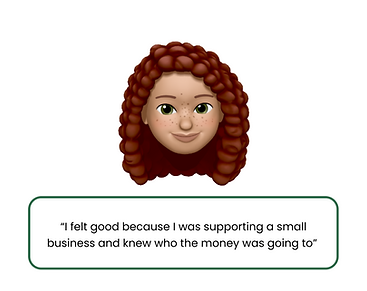
55% of our respondents said that it was extremely important to shop sustainably and ethically. While constructing our interface, we kept this key insight in mind. We incorporated features that show small businesses' sustainable and ethical certifications.
-
67% of our respondents said that they find small businesses through social media.
-
Reviews: One problem that customers face when shopping small is that they prefer buying from trusted more well-known brands since small brands often don’t have sufficient reviews or comments to determine if it is a good-investment product.
Personas


Affinity Diagram
We spent 10 minutes brainstorming some of the key features we would want to include. We then grouped together any ideas that were similar and finalized on these topics. Based on our user interviews/survey results, we found that users would find categories to be helpful. Customers often had trust issues with smaller businesses, so we made sure to include that our application would outsource reviews and make them accessible in our application. We got inspiration from Google, as their reviews are sourced from other websites.
In addition, we found that it was important to include a business ethical statement. Sustainability efforts was an important recurring theme during the ideation phase of our product. We took this and included it into our product, where the small business pages would include a sustainable/ethical statement.
.png)
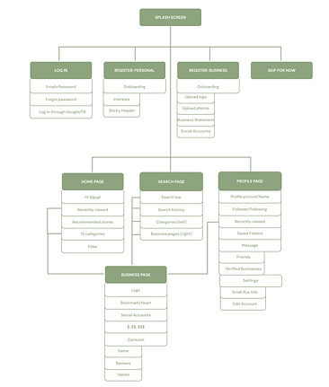
Information Architecture
I then created a visual information architecture that mapped out how we would make it easier for our users to digest all the useful information they would need to know about a small business. It also helped us as designers to get a better understanding of the foundation of our application.
.png)
Sketches


Low Fidelity Wireframes
We split up into pairs to work on lo-fi wireframes to ensure that we were on the same page for the overall aesthetics. Initially, we almost skipped this step entirely due to time constraints, but we ended up making time to complete this step. This step was crucial because it allowed us to map out the overall foundation of our system.

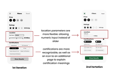
User Testing and Iterations
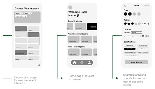
From our feedback and additional research, we found that our categories were not inclusive enough of the different types of services and products that small businesses offered. We originally had 9 categories, but we added 5 more categories. We also made changes to the search page so that users would be able to view the certifications symbols with the text. In our original designs, users had to recall the meanings of certification from a different part of the system. We modified our final design to include the labels.
Through the feedback we received, we were able to create a more intuitive and usable product for our users. Our user testing participants expanded our design thinking. We were so fixated on certain aspects of the system that we overlooked some functions we didn’t see as “important” as the others. We worked on their pain points and iterated our designs to better suit the needs of our users.
.png)

Results and Takeaways
-
🎨Accessible Designs: We spent a lot of time discussing our branding guidelines. We kept going back and forth between the color scheme because we wanted to make sure that we had good color contrast for our users with a visual impairment. I learned that you must compromise on your own aesthetic choices, because accessible designs are much more important than visually aesthetic designs. This choice made us stand out from the other design teams! Although they had a beautiful UI, their designs were not as inclusive and accessible.
-
👯♀️Teamwork: As the project leader, I was afraid that I would not be able to properly lead my team. I do not have the most conventional design background and did not know if I would be able to teach them. My teammates were comprised of designers from different experience levels: no design experience, two somewhat experienced, and a highly experienced designer with a conventional background. We all brought something new to the table and were able to all grow in different areas! This project truly was a learning process, but one huge takeaway was that I should never doubt myself. It is okay to not know everything, learning is an amazing thing and curiosity is a great tool! Design is all about growth and we need to not be afraid to ask questions in order to improve.
-
🗓Timeline: Never underestimate your planned timelines. I created a rough schedule for our 8 week project, but we still fell short on time. As remote students, we had to make time to collaborate on this remote project. During the last 3 weeks, we made extra time outside of our normal meeting times in order to finish. Even though we were pressed on time, we did not want to skip out on any important steps. I worked on lo-fi wireframes for the first time and this is such an underrated step. Previously, my teams would jump straight to the hi-fidelity prototype out of our eagerness to design. But, lo-fi is such an important step to creating the foundation for an application. It also makes sure that all the designers are on the same page (aesthetic wise) before diving straight into high fidelity.